It took me almost all day to decide on a name. I had it narrowed down to "Simple Harmonics" or "Transmitted Reflections" but ultimately decided to use both (especially after they were tied 2-2 in a very scientific poll of four friends). Thanks to Katie, Tom, Alex, Lisa, Dave, and John for reading my many options and giving their opinions. Katie had the brilliant idea of making "Transmitted Reflections" look like a reflection of "Simple Harmonics," so I played around in Photoshop, and the result is now under the name!
The logo did not start out looking like this. At first I had this:
 I was happy with it until my physics kicked in and I realized that it wasn't a true representation of a reflection. In this figure, "transmitted reflections" could be a shadow, but it couldn't be a reflection. If "simpleharmonics" is sitting on a flat mirror and you're looking straight at it, its reflection will never look skewed (diagonal/angled) like this; the reflection will always look to be directly below it and straight. This is because reflection only happens in a plane perpendicular to the mirror. The light has to get from the object to your eye, and there's only one plane in which this can happen - the one that includes the object and your eye and is also perpendicular to the mirror, like so:
 This means that the reflection will always be directly between you and the object, which means that it will look like it is directly below the object and never skewed to one side.
I was not satisfied with a shadow! I wanted a true reflection because of the blog's name. And I wanted something more interesting than a straight, head-on reflection. I decided that maybe it would be right if I "turned" the words (of course achieved here by squishing the right side to look farther away), like this:
 I thought it looked better, and I asked my dad what he thought of it to get another opinion. I explained to him that I didn't think the other was physically correct, and I began to wonder if this one even was. We proceeded to lay out my full length mirror and experiment with the writing on the top of a shoe box for at least half an hour. Even though reflection is a fairly straightforward phenomenon compared to the rest of optics, it's actually pretty interesting! We rotated the words all sorts of ways and looked at them from many different angles. We came to the conclusion that this second design was also not physical. Again, it could be a shadow, but not a reflection. This is because of the same reason explained above. You're still seeing "simpleharmonics" in an upright position, it just looks shorter because you're seeing it at an angle. The reflection will show this change, but it still won't look skewed.
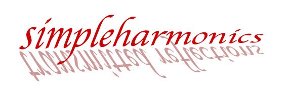
The solution? The reflection will only look skewed if the words themselves look skewed. One way to achieve this is to rotate the words in two different directions. As we saw above, rotating in only one direction doesn't cause anything to be skewed. But what if we rotate the words like we did above and then also rotate them toward the mirror? When they are distorted in two directions like this, the words themselves will look skewed and so will the reflection. Hence the final logo! Both the top and bottom are squished on the right and skewed by the same angle in the same direction. Go find a mirror and try it out. I had to see it to realize what was going on and to figure out how to represent it in two dimension. I'm not sure that this is the only way to achieve skewing, but it is definitely physically correct, unlike the previous designs!
I haven't had much experience writing about something related to math/physics for a potential audience of non-physicists, so I'd love to get some feedback on this! Hopefully I'll be able to improve and write about more complicated topics.
Neeerrrrrrd!
ReplyDeleteI guess my comment doesn't count, since I don't really fall into the category of non-physicist... I think it's awesome that you carried out your own experiment. Should have been an engineer! =P
ReplyDeletedolce and gabbana
ReplyDeleteed hardy outlet
michael kors outlet
michael kors handbags
cheap oakley sunglasses
nike air huarache
ralph lauren pas cher
cheap oakley sunglasses
michael kors outlet
nike air max 90
golden goose outlet
ReplyDeleteyeezy boost 350 v2
kd 12 shoes
westbrook shoes
moncler jacket
jordan shoes
yeezy boost 350 v2
jordans
hermes belt
converse shoes
urfa
ReplyDeleteçankırı
kastamonu
van
yalova
5TBR